-
ASB CLASSIC – WHERE CLASSIC TENNIS MEETS AOTEAROA ENERGY & EDGE
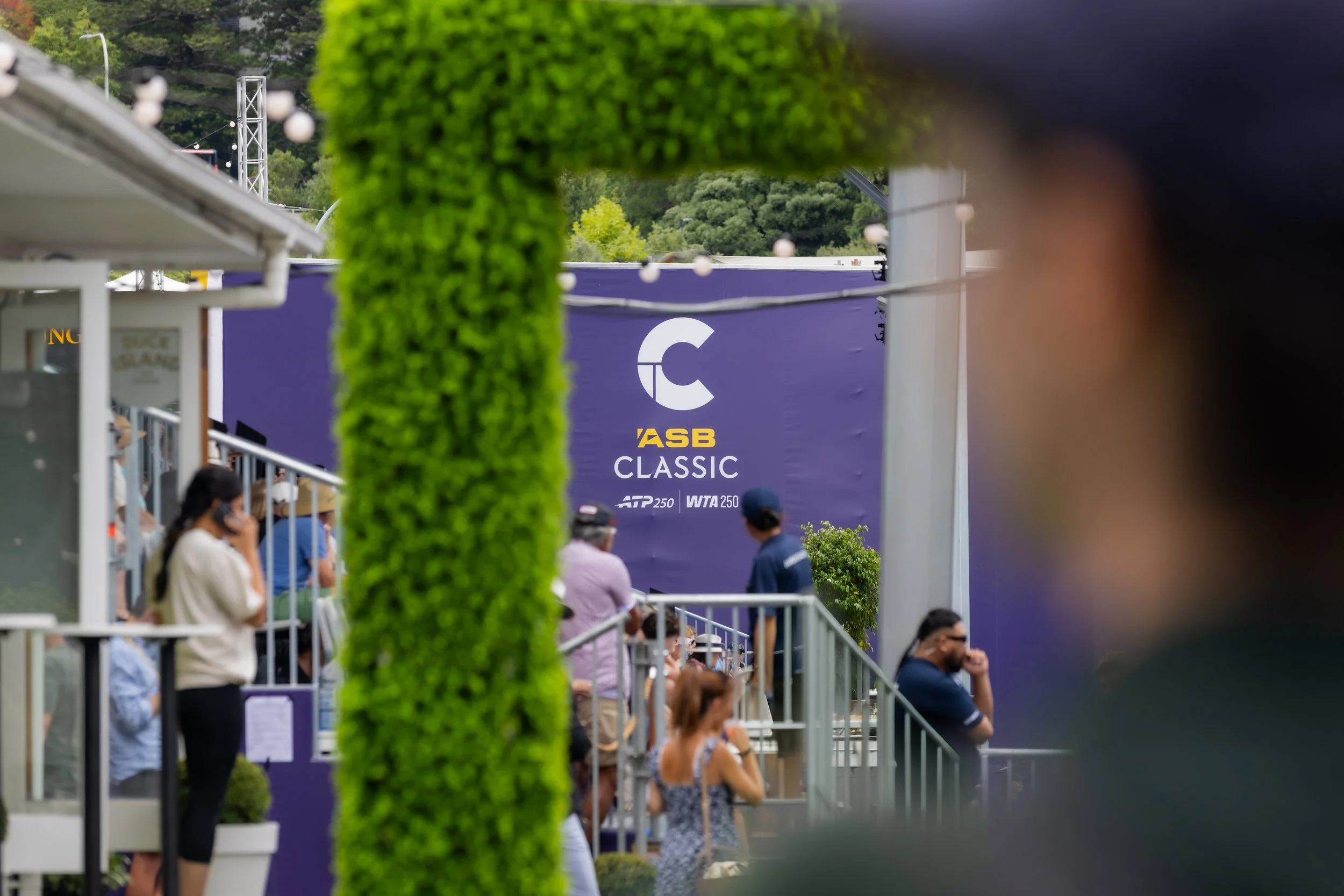
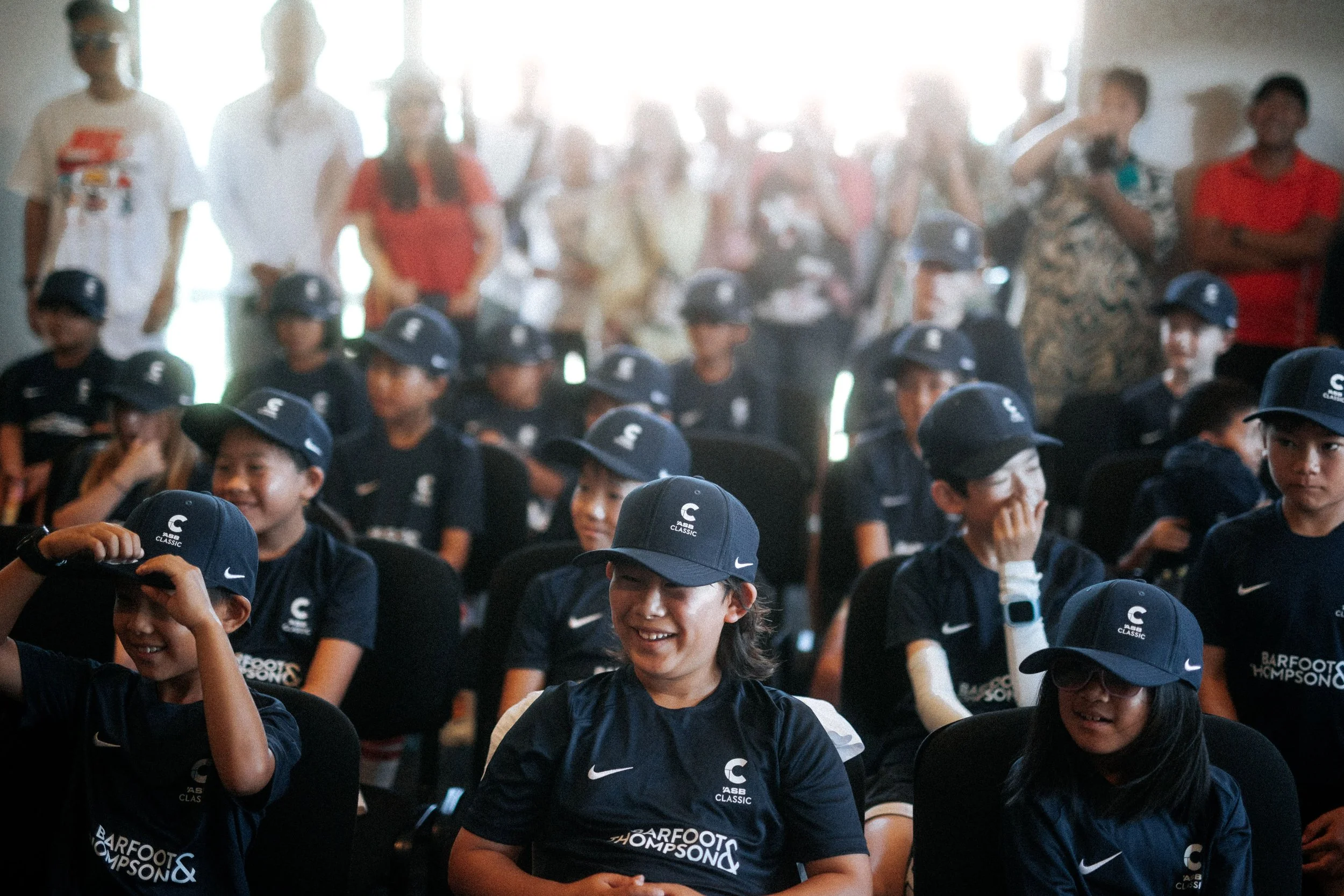
The ASB Classic is not just another stop on a tennis tour – it’s New Zealand’s premier international tennis celebration, set in the heart of Tāmaki Makaurau, Auckland. Our brief was simple but demanding: evolve the brand so it feels as magic as being there, in the stands on finals day. Not just a logo refresh, but a new identity concept that captures the atmosphere – the summer heat, the hospitality, the proximity to the action, and the unmistakable sense that this is the place you need to be.
We wanted to take what made the ‘ASB Classic’ a classic today and amplify that for a new era - closer, more creative, more contemporary and more energetic than ever before. To achieve that we connected it deeply to the land, to the whenua upon which it is hosted here in Tāmaki Makaurau, Auckland. Celebrating it as an unmissable and unique tennis environment – the amphitheatre, the style of hospitality, the feeling and vibe of being here in the Auckland summertime.
The story that really brought this all together was one of a true connection to the land itself. Working with Mana Whenua, Creative Director of Eighty Ltd., Kīngi Makaore of Ngāti Whātua Ōrākei descent, the Tūī became a storytelling anchor for the identity and a guiding light for the wider expression. “Te ako o te Tūī”, or the teachings of the Tūī, being the original name for the place and stage upon which the tournament unfolds every year.
Timeless style, freshly charged with a modern Auckland dynamism
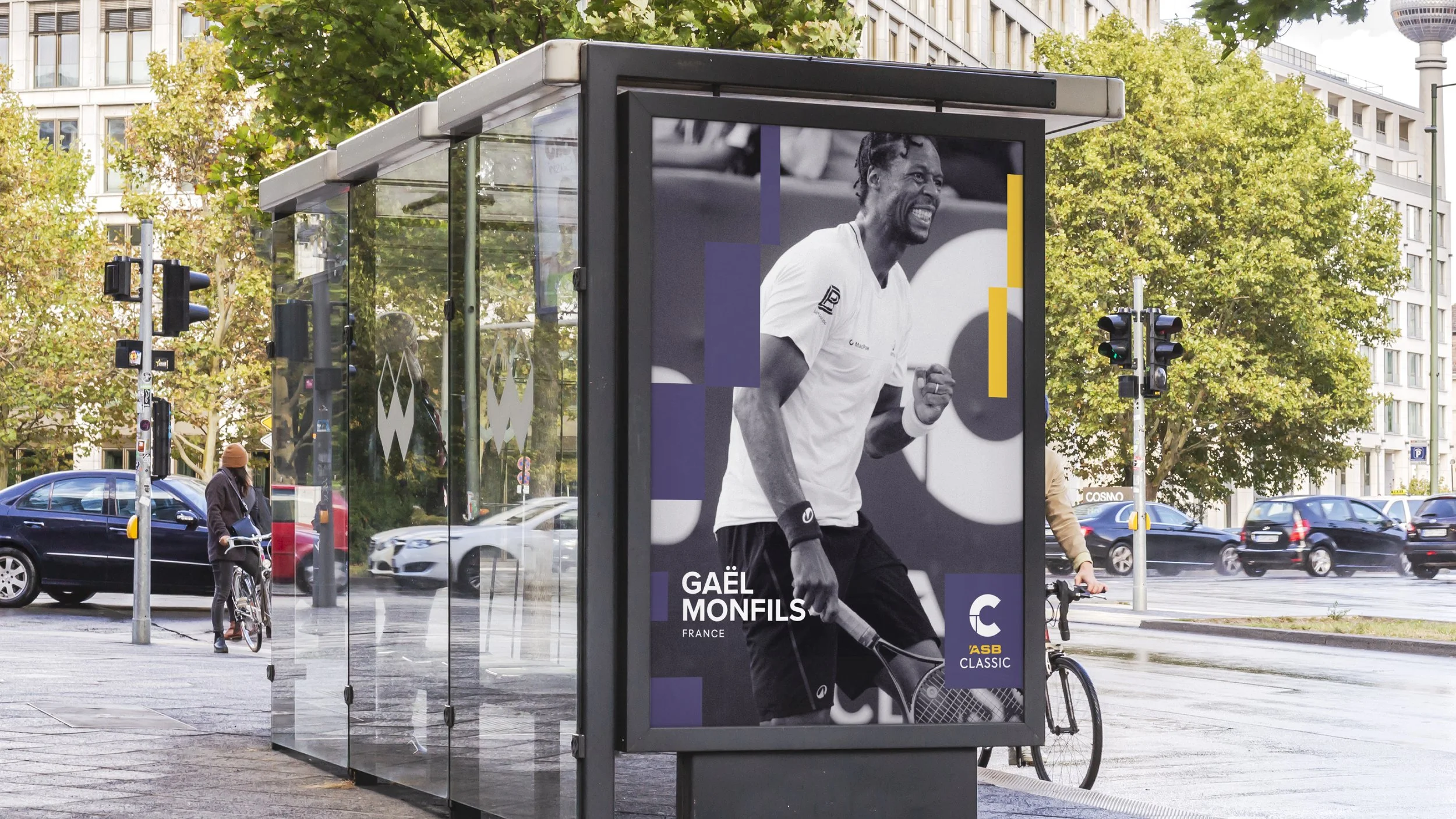
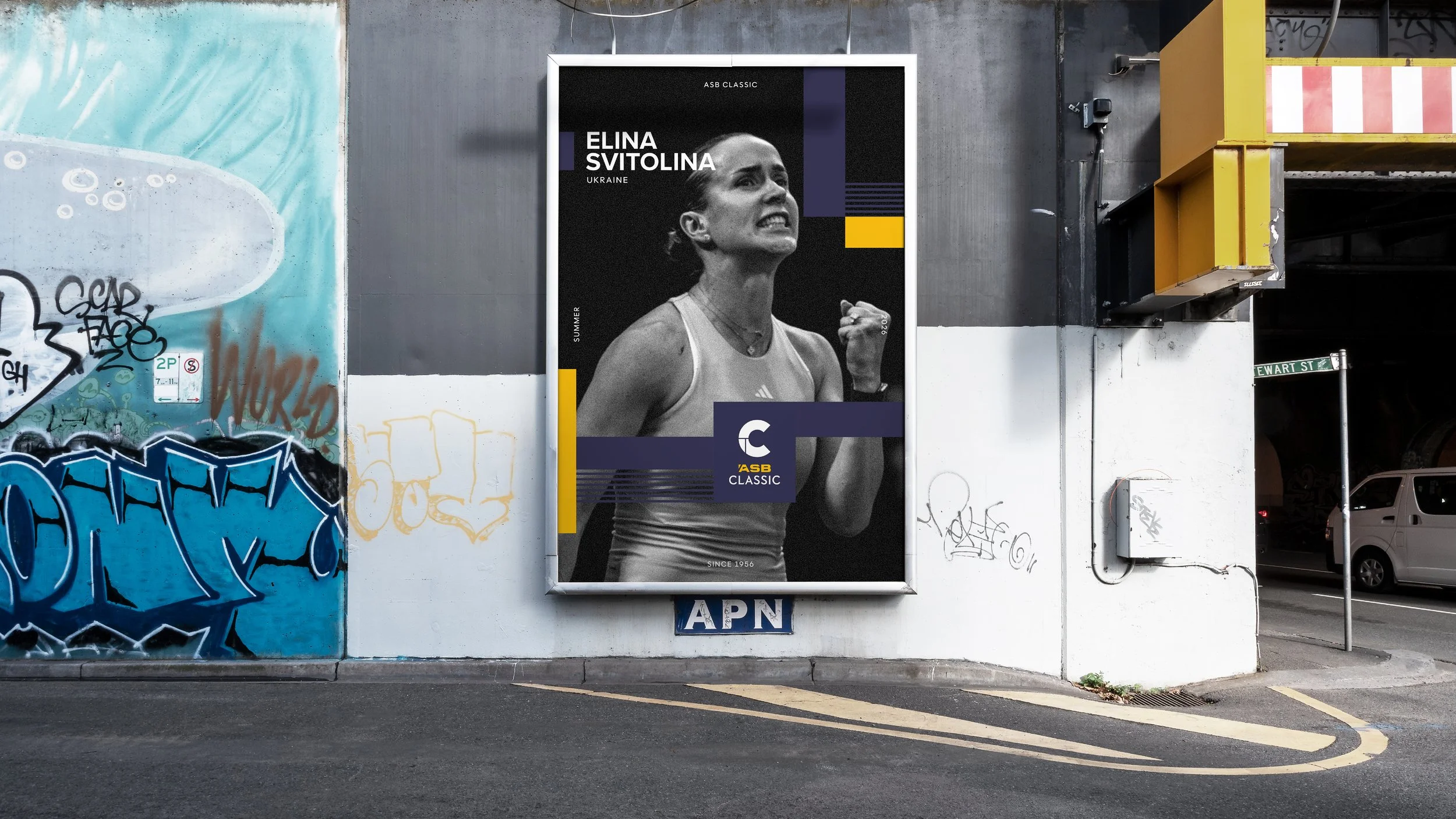
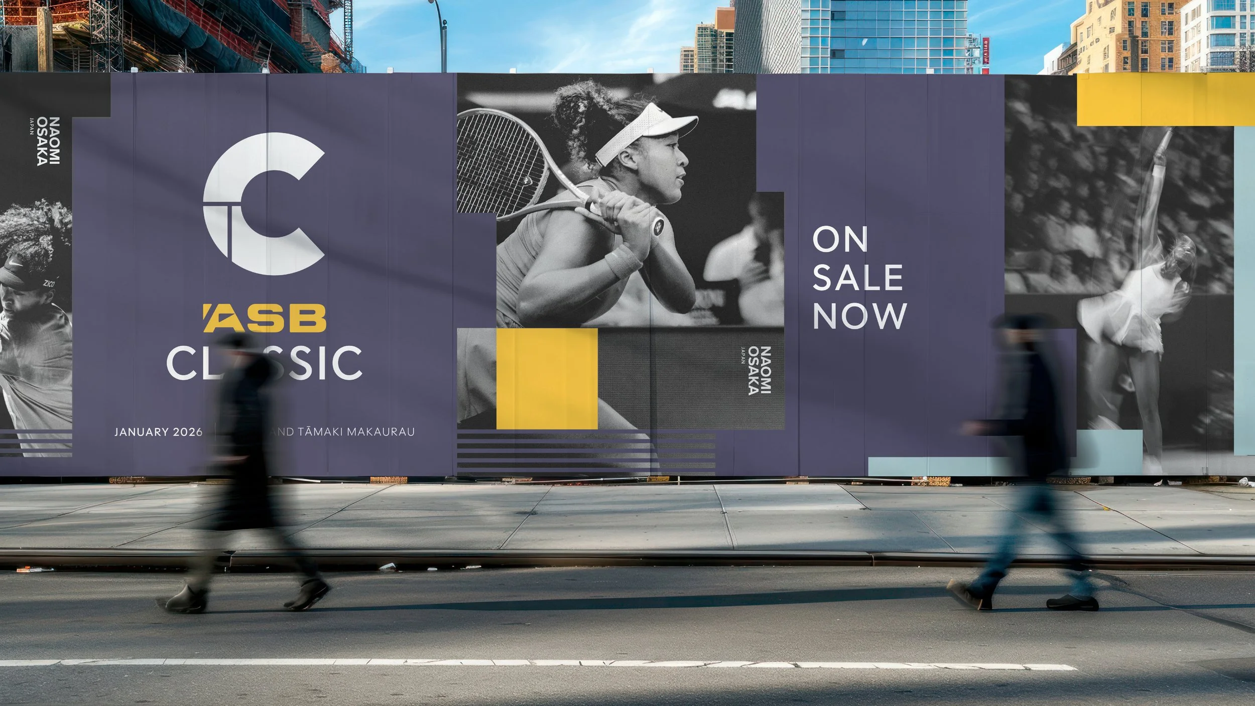
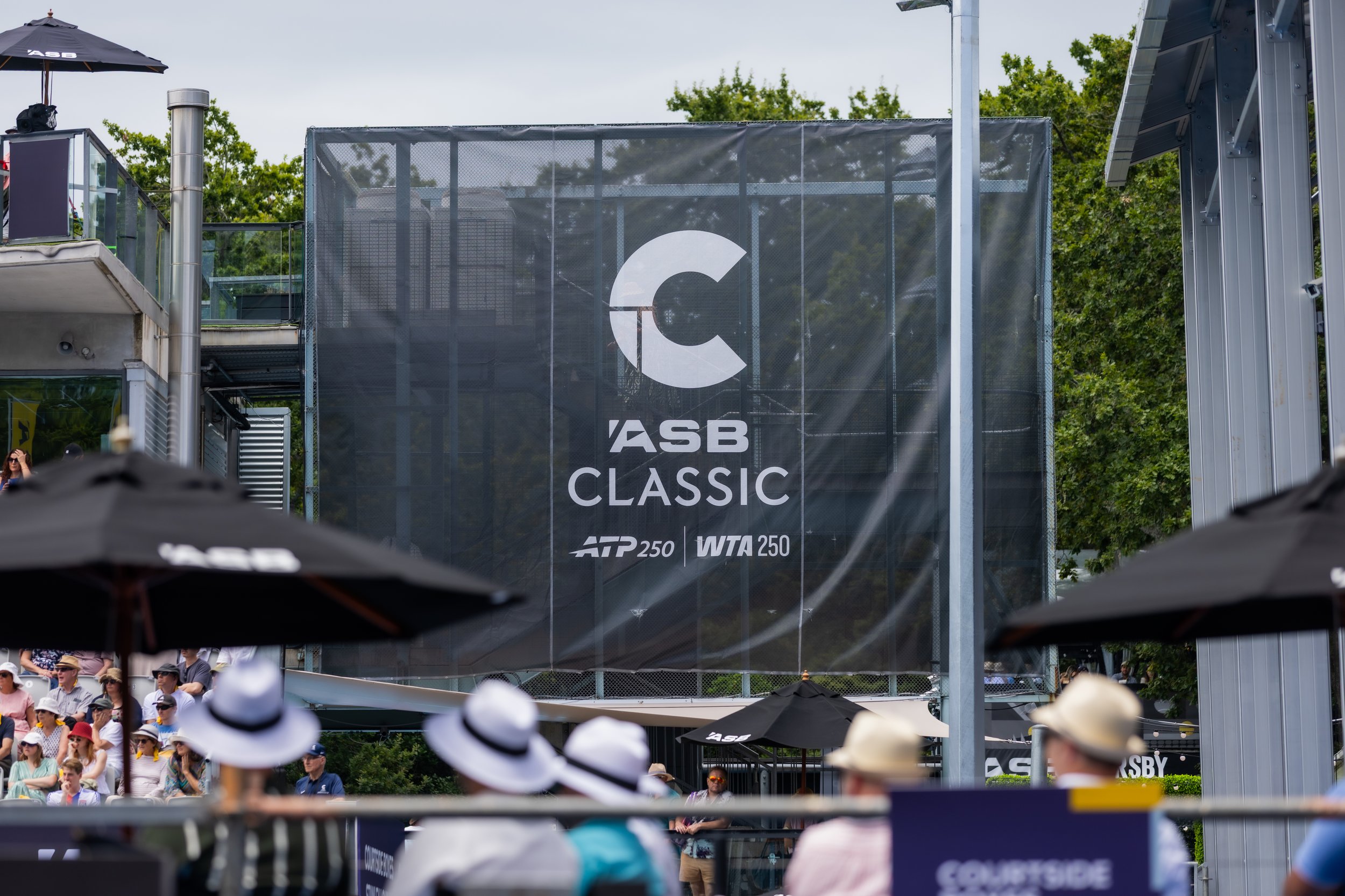
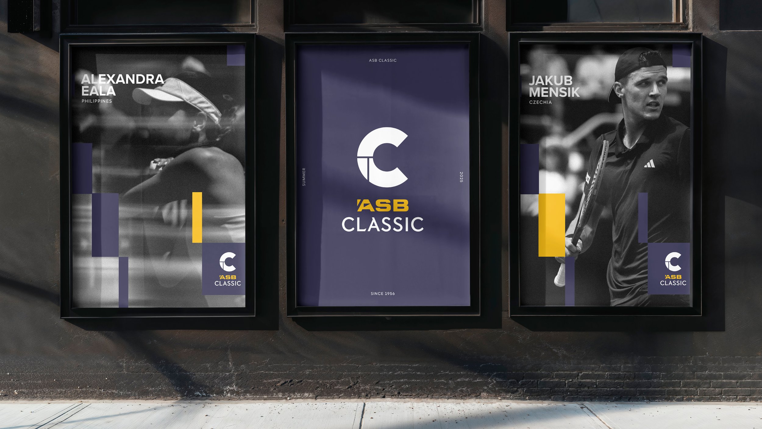
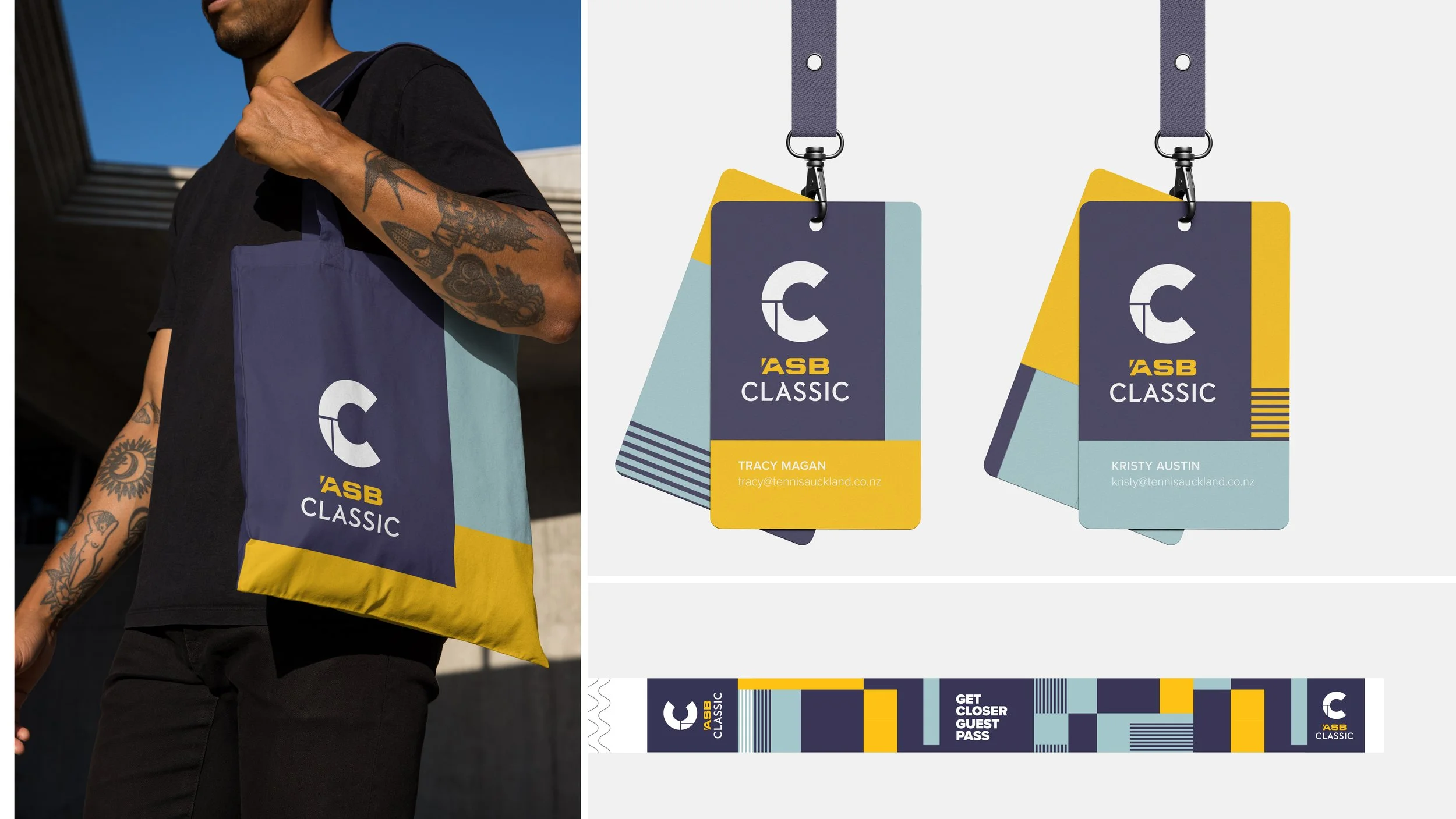
The new ASB Classic identity is timeless with a twist. A sophisticated and elegant move forward. Contemporary in application yet retaining the presence of classic of tennis iconography.
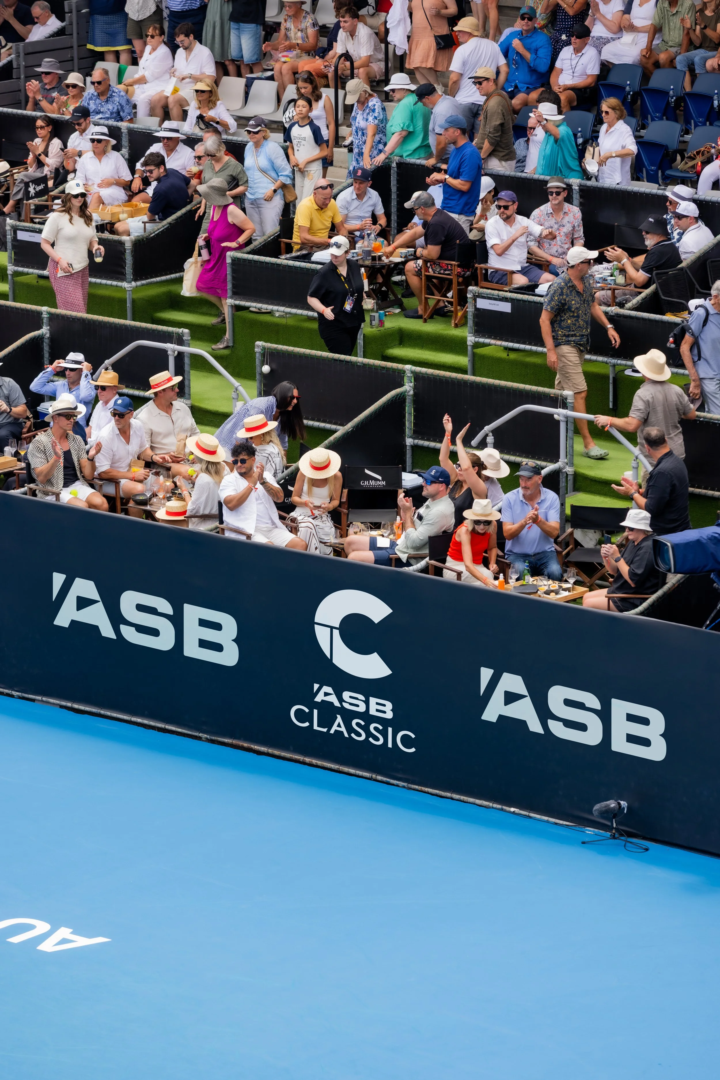
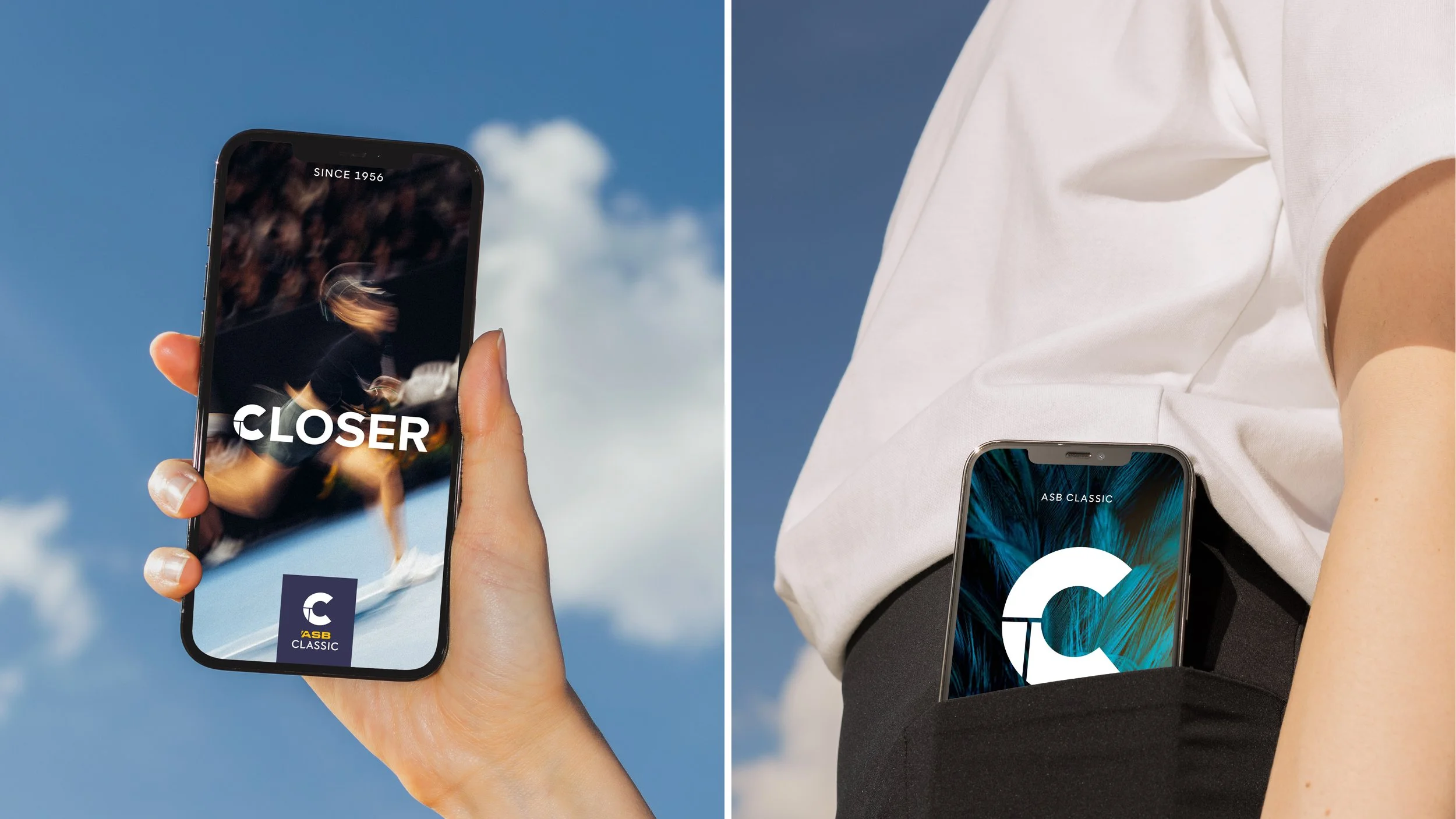
We played off of the idea that physically, you're closer to the action and that created a powerful exchange between the player and the crowd, the tournament and the city.
The international scale and significance, but also the intimacy of the site. A clash of combinations and influences from a tennis tournament at the edge of the world and fresh for the start of a season.
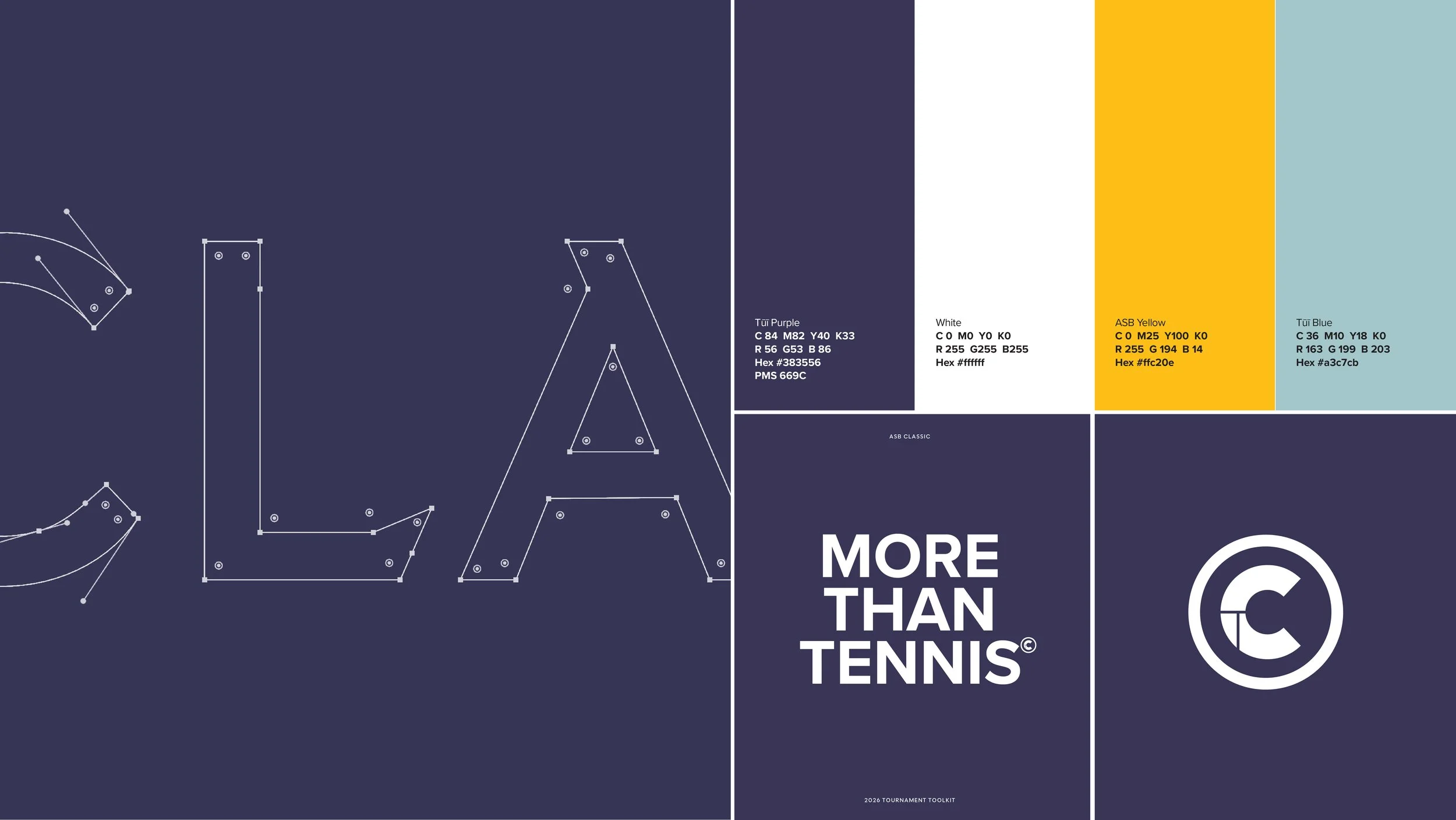
The colour palette is anchored in “Tūī purple”, a deep, elegant hue drawn from the, paired with a lighter “tui blue” inspired by feather iridescence. A palette that provides both a cultural/storytelling device and a way to mark the event as more premium and distinctive in the world of international tennis.
The Tūī purple gave us a surprising but luxurious base to build the brand from, with a tessellated design signature that, even in static executions, inspires movement in the minds eye that suggests the interplay and exchange of a tennis rally.
The result is a brand and expression that traverses the line from high performance sport into high entertainment hospitality, it’s a signature that stands up on court and stands out in the stands – working herd to help create the very best of event environments.
The first year has created a strong foundation rather than a finished destination – a platform to build equity into and on from. ‘Te ako o te Tūī’ and the inspiration of Tūī will be a creative motif that will influence the ongoing storytelling and roll out of the identity across, in particular, the audio‑visual design and cultural narratives.
We want to continue to build on the powerful and uniquely Aotearoa edge the event offers, connecting this concept deeply across key physical and sonic moments, weaving into iconic performances throughout the week and shaping the gifting programme for the players and staff. All plans in play to give totally distinctive touchstones to a tournament described as a much loved stop on the tour.